Tuesday 4 November 2014

Variable-Sized Items in UICollectionView

Variable-Sized Items in UICollectionView

UICollectionView was added last year with iOS 6 and to this date I had no real chance to get acquainted with it since most of my apps were still supporting iOS 5. Doing a fresh app only supporting the latest iOS version finally allowed me to dig into it and share the journey with you.
The special scenario we want to look at today is how we could configure variable-sized collection view cells for items like tags. We want to have the cells adjust their size automatically based on the tag string and ideally we don’t want to have to write any layout code for determine the needed sizes.
Please forgive if the following has a few places where I stumbled. It is these temporary snags that I believe you learn from the most, so I left them in the final article.

Basic Training

We start out with a fresh project from the “Single View Application” template. On the ViewController.xib we add a UICollectionView to fill the entire view.
Adding a UICollectionView
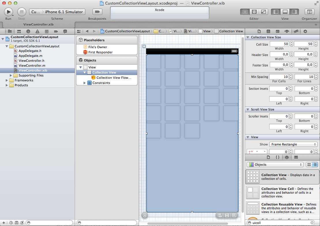
The Collection View – identical to it’s grandfather UITableView – has a delegate and a dataSource outlet which we connect to “File’s Owner”, which is the ViewController class. This puts our view controller also in charge of the collection view’s contents and interactions. We also need an outlet for a reference to the collection view, so we add that with the assistant editor. The outlet property we add to ViewController.h can be weak because being a subview of the ViewController’s view means it is also sufficiently retained.

Cells

For the content we need to design a prototype cell. If you’re using the collection view in a view controller’s XIB you have to register it for use in the collection view in code. If you add a collection view inside a storyboard you create prototype cells inside the collection view’s area and thus won’t have to register the cell identifier. Since we started without a story board, let’s proceed with the manual steps.
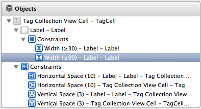
We create a prototype cell in Interface Builder, give it a white background, add a UILabel and add some constraints to link the edges with the superview’s edges, 5 points distance. From the Editor menu we choose “Size to Fit Content” for the Label because we want the label text to determine the item size. We’ll see later if that works as we think.
Adding the Prototype Cell
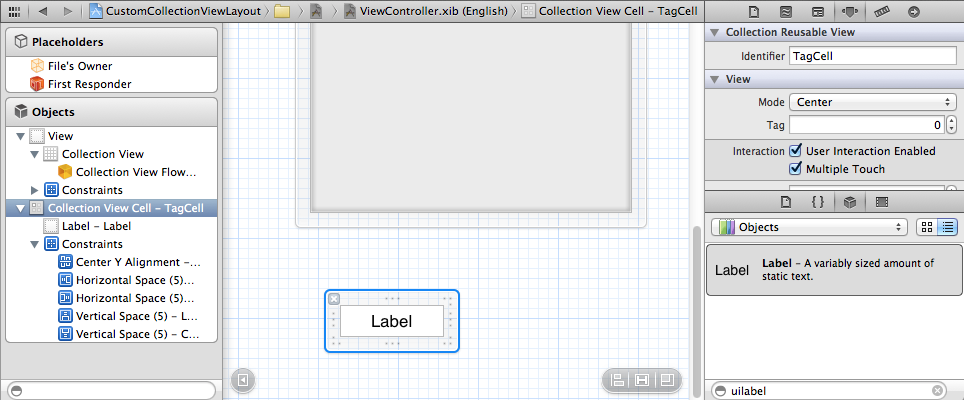
We set the Identifier to “TagCell” so that we can reference our design.
Here we hit the first snag. If you are not using story boards there is no way to get the collection view to use a Collection View Cell from the same NIB file. These are the two methods available for registering a cell design:
  • – registerClass:forCellWithReuseIdentifier:
  • – registerNib:forCellWithReuseIdentifier:
The first instantiates a certain class to be used for a given reuse identifier. This we would use if we created the cell’s view hierarchy entirely in code. The second requires a NIB and thus requires that the cell needs to be the only item in this NIB. This is the second important reason why it is way less work using Collection Views with storyboards, to avoid this hassle.
To remedy this we create a new “empty Interface Builder Document”, which we name TagCollectionViewCell. Thankfully we can simply CMD+X the cell design from one ViewController NIB and CMD+V it into the empty document.
Cell Design moved to own NIB
Next we’ll try to register the cell for use in the collection view and want to see a number of items displayed.

Registering the Cell Design

We need to register the NIB to be used whenever we want a cell for identifier “TagCell”, so we add the following to ViewController.m in the viewDidLoad section.
UINib *cellNib = [UINib nibWithNibName:@"TagCollectionViewCell" bundle:nil];
[self.collectionView registerNib:cellNib forCellWithReuseIdentifier:@"TagCell"];
We only need to implement more methods belonging to the UICollectionViewDataSource protocol to get something to show.
#pragma mark - UICollectionView
 
- (NSInteger)collectionView:(UICollectionView *)collectionView numberOfItemsInSection:(NSInteger)section
{
   return 100;
}
 
- (UICollectionViewCell *)collectionView:(UICollectionView *)collectionView cellForItemAtIndexPath:(NSIndexPath *)indexPath
{
   UICollectionViewCell *cell = [collectionView dequeueReusableCellWithReuseIdentifier:@"TagCell" forIndexPath:indexPath];
 
   return cell;
}
Launching the app now, we see 100 items all using our – probably not award-winning – cell design.
Cells showing up
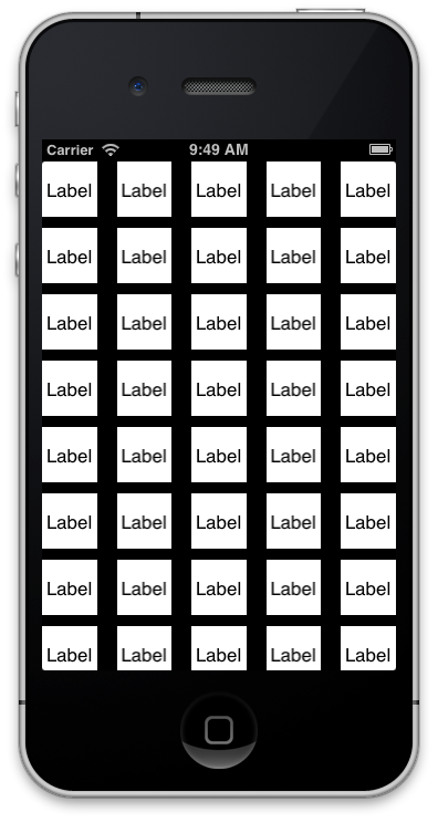
The first observation to make is that all cells have the same size, 50×50 points to be exact. This comes from us not changing the default values in Interface Builder.
UICollectionView Cell Defaults
But before we proceed to giving the cells individual sizes, let’s first improve the design a bit. We remove the white background, add a new TagCollectionViewCell class and specify this as the cell’s class.

Prettier Cells

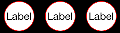
Instead of relying on iOS to fill a rectangle with the cell’s background color, instead we want to have a rounded rect around our labels.
- (void)drawRect:(CGRect)rect
{
   // inset by half line width to avoid cropping where line touches frame edges
   CGRect insetRect = CGRectInset(rect, 0.5, 0.5);
   UIBezierPath *path = [UIBezierPath bezierPathWithRoundedRect:insetRect cornerRadius:rect.size.height/2.0];
 
   // white background
   [[UIColor whiteColor] setFill];
   [path fill];
 
   // red outline
   [[UIColor redColor] setStroke];
   [path stroke];
}
Note: You need to set the cell’s contentMode to redraw because otherwise a modification of its size would not trigger a redraw of this good looking background.
This results in the following look, with parts of the black background shining through. Note that we need to inset the outline drawing slightly because otherwise Quartz would clip the red circle on the outside sections where it touches the view’s frame.
New Background
The next challenge will be to size the cells appropriately for the current Label contents.

Individual Item Sizing

Of course we are not content with using 1) a static size for all items and b) want to have the size automatically adjust to the contents of our cells. Remember that we specified for the cell’s label to use the text size to size it. The edges of the background view are all distanced 5 points away from the edges of the label. So it would be awesome if there was a method to retrieve a cells actual size. Then it would be even more awesome to tell the collection view to use these individual sizes for the items.
A quick test in LLDB shows that the cell returns an intrinsicContentSize of -1, -1 which is the same as not defined. We add an outlet for the label to the TagCollectionViewCell’s header and then we find that conveniently the UILabel returns the size needed by the currently set text/font.
Since we know the amount of space around the constraints we can add that to the label’s intrinsic content size to derive the cell’s size.
// cache for margins configured via constraints in XIB
static CGSize _extraMargins = {0,0};
 
@implementation TagCollectionViewCell
 
- (CGSize)intrinsicContentSize
{
   CGSize size = [self.label intrinsicContentSize];
 
   if (CGSizeEqualToSize(_extraMargins, CGSizeZero))
   {
      // quick and dirty: get extra margins from constraints
      for (NSLayoutConstraint *constraint in self.constraints)
      {
         if (constraint.firstAttribute == NSLayoutAttributeBottom || constraint.firstAttribute == NSLayoutAttributeTop)
         {
            // vertical spacer
            _extraMargins.height += [constraint constant];
         }
         else if (constraint.firstAttribute == NSLayoutAttributeLeading || constraint.firstAttribute == NSLayoutAttributeTrailing)
         {
            // horizontal spacer
            _extraMargins.width += [constraint constant];
         }
      }
   }
 
   // add to intrinsic content size of label
   size.width += _extraMargins.width;
   size.height += _extraMargins.height;
 
   return size;
}
 
@end
This approach gets the actual margin widths from the constrains we have set in Interface Builder. This allows us to keep tweaking the amounts in IB without having to change some constant or #define in code. Since we don’t plan to modify any constraints, we’re lazily setting the static _extraMargins the first time this method is called, as those are constant.
Now the tricky part is dequeue a cell for reuse from the collection view to get the size. This is tricky because the method that calls our dataSource’s collectionView cellForItemAtIndexPath: is also calling collectionView:layout:sizeForItemAtIndexPath:. This prohibits us from dequeuing a cell in the latter method because that would lead to an endless loop.
Some people get their data from a model object and then have a class method on the cell to calculate the needed size. However this doesn’t make use of any constraints which we want to be able to configure in Interface Builder. The smartest solution I could come up with for this chicken and egg problem is to have a separate instance of one such cell as a template and then use its freshly overridden intrinsicContentSize method.
@implementation ViewController
{
   TagCollectionViewCell *_sizingCell;
}
 
- (void)viewDidLoad
{
   [super viewDidLoad];
 
   UINib *cellNib = [UINib nibWithNibName:@"TagCollectionViewCell" bundle:nil];
   [self.collectionView registerNib:cellNib forCellWithReuseIdentifier:@"TagCell"];
 
   // get a cell as template for sizing
   _sizingCell = [[cellNib instantiateWithOwner:nil options:nil] objectAtIndex:0];
}
 
#pragma mark - UICollectionView
 
- (NSInteger)collectionView:(UICollectionView *)collectionView numberOfItemsInSection:(NSInteger)section
{
   return 100;
}
 
- (void)_configureCell:(TagCollectionViewCell *)cell forIndexPath:(NSIndexPath *)indexPath
{
   if (indexPath.row%2)
   {
      cell.label.text = @"A";
   }
   else if (indexPath.row%3)
   {
      cell.label.text = @"longer";
   }
   else 
   {
      cell.label.text = @"much longer";
   }
}
 
- (UICollectionViewCell *)collectionView:(UICollectionView *)collectionView cellForItemAtIndexPath:(NSIndexPath *)indexPath
{
   TagCollectionViewCell *cell = [collectionView dequeueReusableCellWithReuseIdentifier:@"TagCell" forIndexPath:indexPath];
 
   [self _configureCell:cell forIndexPath:indexPath];
 
   return cell;
}
 
- (CGSize)collectionView:(UICollectionView *)collectionView layout:(UICollectionViewLayout*)collectionViewLayout sizeForItemAtIndexPath:(NSIndexPath *)indexPath
{
   [self _configureCell:_sizingCell forIndexPath:indexPath];
 
   return [_sizingCell intrinsicContentSize];
}
 
@end
Right after registering the NIB for use by the collection view I’m creating an instance of the cell and put it into my _sizingCell IVAR. To get an actual item’s cell we have a _configureCell:forIndexPath: method which we call on a dequeued reusable cell instance. For sizing we apply the same method on our sizing cell so that we get the correct intrinsicContentSize for that.

Once More With Auto Layout

When I asked my Tweeps about how I could ask a cell for how much size it would want based on the set constraints,Martin Pilkington was quick to point me towards  -systemLayoutSizeFittingSize:. At first I failed in its application, kept getting {0,0}. But after having written the above workaround I took a heart and tried it once more.
And it worked right away. All that’s needed is to replace this method:
- (CGSize)collectionView:(UICollectionView *)collectionView layout:(UICollectionViewLayout*)collectionViewLayout sizeForItemAtIndexPath:(NSIndexPath *)indexPath
{
   [self _configureCell:_sizingCell forIndexPath:indexPath];
 
   return [_sizingCell systemLayoutSizeFittingSize:UILayoutFittingCompressedSize];
}
This method determines the layout size that fits the passed size the closest. Two standard values are available, UILayoutFittingCompressedSize for getting the smallest size based on the layout constraints, UILayoutFittingExpandedSize to get the largest.
With this in please we can actually get rid of all the intrinsicContentSize stuff we wrote earlier. Also we can fully use the layout constraints to further restrict individual parts of our item cell. Say that you want the label to not go below a certain width for very short labels, and if the label gets too unwieldy then we would want to have the tail truncated.
Further Constrained
This results in the following result, proving that this is indeed what we want.
Custom Sizes
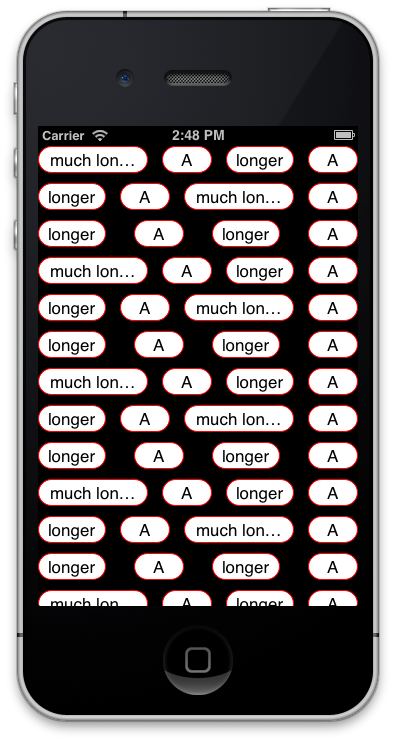
Isn’t that awesome? Let me stress that one more time: you do not need to calculate sizes in a cell class method, essentially duplicating the calculations auto layout would execute. You just ask the system .

Conclusion

In this blog post I have shown how you would create item cells for collections views coming from NIB files. An alternative – and in some aspects more convenient – method is to use the collection view in a storyboard. There the cell prototype would be positioned not in a separate XIB file, but right in the structure hierarchy of the collection view. Exploring how to get a sizing cell there is left as an exercise for the reader.
We found that UILabel conveniently exposes an intrinsicContentSize which is used by auto layout to size it if you specify that in Interface Builder. We explored a technique where we would use a cell instance as template for determine the optimal item size. Then we went one step further and employed a method that actually tells us the perfect size based on all layout constrains and intrinsic sizes.
The code for this example is available on the Cocoanetics Examples repo on GitHub.

Monday 29 September 2014

Can multiple (two) persistent stores be used with one object model, while maintaining relations from one to the other?

The answer is yes. @Caleb points to the right resources, but getting it to work is still quite awkward. I thought I'd place a resumé here:
For two NSPersistentStore instances to share the same model, you have to add a configuration to your model, which is a string-named subset of the entities:
Model configurations
In the model, to an entity that belongs to the second store, you add a fetched property (NSFetchedPropertyDescription for googlability). This is somewhat of a very simple stored procedure, and it could look like this:
NSPredicate format for the fetched property
Then, when you add the stores to your persistent store coordinator, you use the strings for the configuration argument (more info about the options here):
[persistentStoreCoordinator addPersistentStoreWithType:NSSQLiteStoreType 
                                          configuration:@"ModifyInBackground" 
                                                    URL:storeURL1
                                                options:options
                                                  error:&error]

[persistentStoreCoordinator addPersistentStoreWithType:NSSQLiteStoreType 
                                          configuration:@"ModifyInMain"
                                                    URL:storeURL2 
                                                options:options 
                                                  error:&error]
Finally, when you want to get from the entity in store B to the entity in store A, you trigger the fetched property like you would trigger a fault, just by accessing it.
Note: A fetched property always returns an NSArray, because the predicate you write to establish the link might have multiple results. If you want to get to just one entity, you could place something like this in a wrapper method of your NSManagedObject subclass:
Wallpaper *recordedWallpaper = [record.wallpaper lastObject];

Sunday 21 September 2014

UIAlertController Changes in iOS 8


As part of the theme of iOS 8 to make interfaces adaptive there are some major changes to the presentation of view controllers. The new UIPresentationController does a lot of the hard work of animating view controller transitions and adapting to device size changes such as rotation. It also brings some big changes to some old UIKit favourites such as alert views, action sheets, popovers and search bar controllers. This post will be a gentle introduction to this new world by looking at the changes to alert views and action sheets.

UIAlertView - Alerting the Old Way

The last time I wrote about alert views was back in 2011 to describe the UIAlertView changes in iOS 5. The release of iOS 5 brought alert view styles but not much else has changed since then. The code snippet below is all it takes to setup and present an alert view with cancel and OK buttons:
UIAlertView *alertView = [[UIAlertView alloc]
                           initWithTitle:@"DefaultStyle" 
                           message:@"the default alert view style"
                           delegate:self 
                           cancelButtonTitle:@"Cancel" 
                           otherButtonTitles:@"OK", nil];

[alertView show];
The introduction of alert view styles in iOS 5 added a limited ability to create custom alerts by setting the alertViewStyle property. This extended the plain default button-only style to allow plain text input, secure text input or even a login and password input alert:
Basic Two Button Alert Text Input Alert Secure Text Input Alert Login and Password Alert
The UIAlertViewDelegate protocol has callback methods for the button actions and also a method (alertViewShouldEnableOtherButton:) called when a text field changes to allow buttons to be dynamically enabled/disabled.

UIAlertController - Adaptive Alerting

In the new adaptive world of iOS 8 the UIAlertController is a functionally identical, block-based replacement for both UIAlertView and UIActionSheet. Switching between an alert or action sheet is done by setting the preferred style when creating the controller.

A Simple Alert

It is interesting to compare the code required to setup a new style alert to the old UIAlertView. The creation of the basic UIAlertController is very similar to creating an UIAlertView (the alertTitle and alertMessage are both NSString’s):
UIAlertController *alertController = [UIAlertController
                              alertControllerWithTitle:alertTitle
                              message:alertMessage
                              preferredStyle:UIAlertControllerStyleAlert];
There is no delegate, nor do we initially specify the buttons. Note the third parameter which chooses between the alert and action sheet styles.
You add action buttons by creating an instance of UIAlertAction which you then add to the controller. The UIAlertAction consists of a title string, style and a block to execute when the user selects the action. The three possible choices for the UIAlertActionStyle cover default, cancel and destructive actions. To reproduce the classic cancel/ok action sheet we just need to create and add the two alert actions:
UIAlertAction *cancelAction = [UIAlertAction 
            actionWithTitle:NSLocalizedString(@"Cancel", @"Cancel action")
                      style:UIAlertActionStyleCancel
                    handler:^(UIAlertAction *action)
                    {
                      NSLog(@"Cancel action");
                    }];

UIAlertAction *okAction = [UIAlertAction 
            actionWithTitle:NSLocalizedString(@"OK", @"OK action")
                      style:UIAlertActionStyleDefault
                    handler:^(UIAlertAction *action)
                    {
                      NSLog(@"OK action");
                    }];

[alertController addAction:cancelAction];
[alertController addAction:okAction];
Finally we can present the alert view controller as with any other view controller:
[self presentViewController:alertController animated:YES completion:nil];
The display order for the buttons depends on the order they are added to the alert controller. If you follow the iOS Human Interface Guidelines you should make the default action the right button and the cancel button the left button for a two button alert. You can only have one cancel action, if you add a second you will get a runtime exception:
*** Terminating app due to uncaught exception ‘NSInternalInconsistencyException’, reason: ‘UIAlertController can only have one action with a style of UIAlertActionStyleCancel’

Destructive actions

Here is a quick example of the third alert action style for destructive actions. The code is the same as before except that we add a “reset” button instead of the “ok” button:
UIAlertAction *resetAction = [UIAlertAction
             actionWithTitle:NSLocalizedString(@"Reset", @"Reset action")
                       style:UIAlertActionStyleDestructive
                     handler:^(UIAlertAction *action)
                     {
                       NSLog(@"Reset action");
                     }];

[alertController addAction:resetAction];
[alertController addAction:cancelAction];

[self presentViewController:alertController animated:YES completion:nil];
Note that this time the destructive action is added first to make it appear on the left.

Text Input Alerts

The greater flexibility of the UIAlertController means that you no longer need to be constrained by the built-in styles for plain text, secure text or login and password input alert views. We can add an arbitrary number of UITextField objects to the alert and use all of the standard UITextField configuration options. When you add the text field to the alert controller you specify a block that is used to configure the text field.
For example, to recreate the old login and password style alert we can add two text fields and configure them with the appropriate placeholder text and set the password field to use secure text entry:
UIAlertController *alertController = [UIAlertController
                    alertControllerWithTitle:alertTitle
                                     message:alertMessage
                              preferredStyle:UIAlertControllerStyleAlert];

[alertController addTextFieldWithConfigurationHandler:^(UITextField *textField)
 {
   textField.placeholder = NSLocalizedString(@"LoginPlaceholder", @"Login");
 }];

[alertController addTextFieldWithConfigurationHandler:^(UITextField *textField)
 {
   textField.placeholder = NSLocalizedString(@"PasswordPlaceholder", @"Password");
   textField.secureTextEntry = YES;
 }];
The values of the text field can be retrieved in the OK action handler:
UIAlertAction *okAction = [UIAlertAction
  actionWithTitle:NSLocalizedString(@"OK", @"OK action")
  style:UIAlertActionStyleDefault
  handler:^(UIAlertAction *action)
  {
    UITextField *login = alertController.textFields.firstObject;
    UITextField *password = alertController.textFields.lastObject;
    ...
  }];
Things get a little more complicated if we want to reproduce the behaviour of the old UIAlertView delegate method alertViewShouldEnableOtherButton:. Assume we only want to enable the OK button if the user has entered at least 3 characters in the login field. There is no equivalent delegate method for UIAlertController so we need to add an observer to the login text field. We can do that with the following code snippet in the configuration block:
[alertController addTextFieldWithConfigurationHandler:^(UITextField *textField)
 {
    ...
    [[NSNotificationCenter defaultCenter] addObserver:self
                            selector:@selector(alertTextFieldDidChange:)
                                name:UITextFieldTextDidChangeNotification
                              object:textField];
 }];
We need to remove the observer when the view controller is dismissed by adding the appropriate code to the handler block for each of the actions (and anywhere else we may dismiss the alert controller). For example in the okAction block we saw earlier:
UIAlertAction *okAction = [UIAlertAction 
  actionWithTitle:NSLocalizedString(@"OK", @"OK action")
  style:UIAlertActionStyleDefault
  handler:^(UIAlertAction *action)
  {
    ...
    [[NSNotificationCenter defaultCenter] removeObserver:self
                                 name:UITextFieldTextDidChangeNotification
                               object:nil];
  }];
Before presenting the alert controller we can disable the OK action:
okAction.enabled = NO;
Then in the notification observer we can check the login text field for content before changing the state back to enabled:
- (void)alertTextFieldDidChange:(NSNotification *)notification
{
  UIAlertController *alertController = (UIAlertController *)self.presentedViewController;
  if (alertController)
  {
    UITextField *login = alertController.textFields.firstObject;
    UIAlertAction *okAction = alertController.actions.lastObject;
    okAction.enabled = login.text.length > 2;
  }
}
The alert view is now presented with the OK button disabled unless there are at least three characters in the login text field:

Action Sheet

The action sheet is used when you need to present the user with a set of choices. Unlike the alert view which is always presented as a modal view the presentation of the action sheet depends on the device size. On an iPhone (compact width) the action sheet rises from the bottom of the screen. On an iPad (regular width) an action sheet is always shown in a popover.
The creation of an action sheet is almost identical to an alert, the only difference being the style:
UIAlertController *alertController = [UIAlertController
               alertControllerWithTitle:alertTitle
                                message:alertMessage
                         preferredStyle:UIAlertControllerStyleActionSheet];
You add actions the same way as you do for alerts so I will abbreviate the code to add three actions:
UIAlertAction *cancelAction = ...;  // UIAlertActionStyleCancel
UIAlertAction *deleteAction = ...;  // UIAlertActionStyleDestructive
UIAlertAction *archiveAction = ...; // UIAlertActionStyleDefault

[alertController addAction:cancelAction];
[alertController addAction:deleteAction];
[alertController addAction:archiveAction];
You cannot add text fields to action sheets, if you try it you will get a runtime exception:
*** Terminating app due to uncaught exception ‘NSInternalInconsistencyException’, reason: ‘Text fields can only be added to an alert controller of style UIAlertControllerStyleAlert’
If we do nothing more and present this on an iPhone/compact width device it works as expected:
[self presentViewController:alertController animated:YES completion:nil];
The cancel button, if present, is always shown as the bottom of the view regardless of the order it was added to the alert controller. The other actions are shown top to bottom in the order they were added. The iOS Human Interface Guidelines recommend that any destructive action is shown first.
There is a problem with this code when used on an iPad or regular width device it creates a runtime exception:
Terminating app due to uncaught exception ‘NSGenericException’, reason: ‘UIPopoverPresentationController (<_UIAlertControllerActionSheetRegularPresentationController: 0x7fc619588110>) should have a non-nil sourceView or barButtonItem set before the presentation occurs.’
At the time of writing the Apple UICatalog sample code crashes for the same reason when run on an iPad.
As I mentioned before for regular width presentations the action sheet is displayed in a popover. A popover always requires an anchor point which can be a source view or a bar button item. In this case I am using a standard UIButton to trigger the action sheet so I will use it as the anchor point.
A big difference in iOS 8 is that we no longer need to write code to test for the interface idiom. The UIAlertController takes care of adapting to the display environment so we can simply ask it for a popover controller. On an iPhone/compact width device this returns nil. The extra code we need to configure the popover is below:
UIPopoverPresentationController *popover = alertController.popoverPresentationController;
if (popover)
{
    popover.sourceView = sender;
    popover.sourceRect = sender.bounds;
    popover.permittedArrowDirections = UIPopoverArrowDirectionAny;
}
The UIPopoverPresentationController class is also new in iOS 8 and replaces UIPopoverController and for our purposes is functionally equivalent. The action sheet now displays as a popover anchored to the source button:
Note that the UIAlertController is also smart enough to remove the cancel button when using a popover. A user cancels a popover by touching outside of the popover so it is not required.

Dismissing Alert Controllers

Typically the alert controller is dismissed automatically when the user selects an action. It can also be dismissed programmatically, if required, like any other view controller. One common reason can be to remove the alert or action sheet when the app moves to the background. Assuming we are listening for the UIApplicationDidEnterBackgroundNotification notification we can dismiss any presented view controller in the observer (see the example code for the setup of the observer in viewDidLoad):
- (void)didEnterBackground:(NSNotification *)notification
{
  [[NSNotificationCenter defaultCenter] removeObserver:self
                         name:UITextFieldTextDidChangeNotification
                        object:nil];
  [self.presentedViewController dismissViewControllerAnimated:NO completion:nil];
}
Note that to be safe we also make sure to remove any text field observers we may have added to the alert controller.

In Summary

A long post but hopefully it will be another three years before I need to write about alert and action sheets again. The old UIAlertView and UIActionSheet classes still work fine in iOS 8 so if you need to target iOS 7 there is no rush to migrate immediately. The AlertController sample Xcode project for this post can be found in my GitHub CodeExamples repository.

203 Favorite JavaScript Utilities

https://1loc.dev/